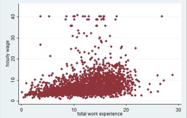
One way to visualize a simple regression model is to use a scatter plot. For this example we're gonna use the nlsw88 dataset and specifically how hourly wage (wage) is affected by total work experience (ttl_exp).
sysuse nlsw88, clear
twoway (scatter wage ttl_exp) (scatter wage ttl_exp), ylabel(0(10)45) xlabel(0(10)30)
The twoway command is used to create a scatter plot in this case with the y- and x-axis variables as arguments. The y- and x-labels are then configured to start from the lowest value (0) and increment in steps of 10. The values 45 and 30 denote the max values to show on each axis.
