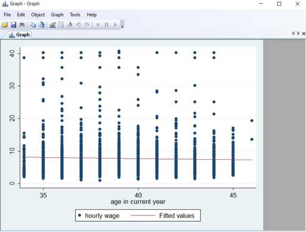
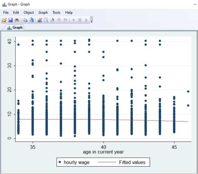
In the last post we looked at linear fit in order to visualize relationships between two variables. For instance we can explore the relationship between wage and age in the nlsw88 dataset.
sysuse nlsw88, clear
twoway (scatter wage age) (lfit wage age)
There actually seems to be a negative relationship between those two variables. Maybe this can be seen clearer if we apply the quadratic fit instead:
twoway (scatter wage age) (qfit wage age)
As shown in this example the quadratic fit makes a slightly better job of visualizing the negative relationship between the two variables, meaning that among surveytakers in the sample wage actually goes down with age.

