Just as with commands such as describe or summarize, drawing pie charts can be useful when familiarizing with a new dataset (or for visualization in general). Arguably, the advantage with pie charts over some other chart types lie in their simplicity, they are easily understood and interpreted. To illustrate, let's load up the nlsw88 dataset and look at an example.
sysuse nlsw88, clear
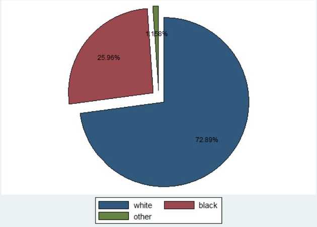
graph pie, over(race) pie(_all, explode) plabel(_all percent, color(black)) line(lcolor(black))
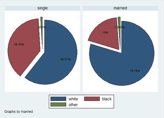
In this example we drew a pie chart over race, we exploded the slices for increased visibility and then used black color for labels and lines. Another option would be to draw another chart by another variable for comparison. For instance we can further visualize the distribution of race by single and married, like so:
graph pie, over(race) pie(_all, explode) plabel(_all percent, color(black)) line(lcolor(black)) by(married)

