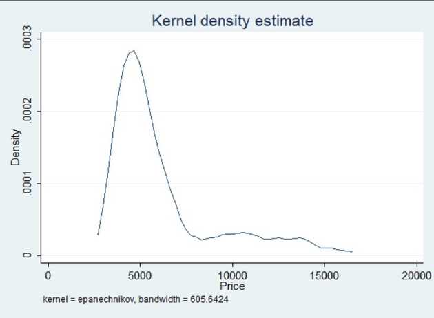
Performing a Kernel density estimation in Stata is a simple task. In particular it can be visualized by way of a kernel density plot which we will look at here:
sysuse auto, clear
kdensity price
As we can see prices are not normally distributed. They have a long right tail indicating a few very high-priced vehicles, over $15000.
Kernel density plots are ofen used to illustrate differences between different subgroups within a sample or distribution by overlaying the resulting graphs on top of eachother. In Stata this can be achieved with the twoway command, which we'll look at in a subsequent post.
