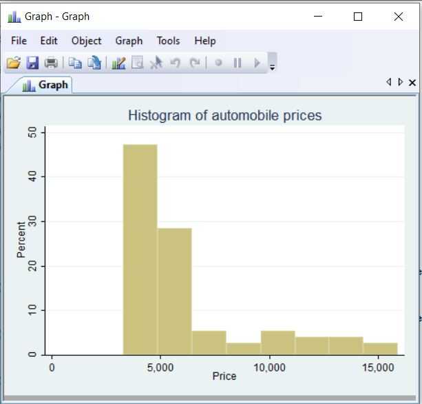
Stata offers basic graphic visualization, which can be useful to get grasp of the distribution of a variable. As evertything in Stata, it's possible to use the GUI, in this case it's available under the Graphics dropdown. However in my opinion it is almost always preferable to use the command editor. If we want to look at histogram of 1978 automobile prices, for instance:
sysuse auto, clear
histogram price, percent ytitle(Percent) xtitle(Price) title(Histogram of automobile prices)
We are presented with a resulting histogram in a separate window. For this basic example we used a histogram, we chose percent for the y-axis, titles for the x- and y-axises as well as a title for the histogram:
